Still working on theming the site and installing the plug-ins I want.
I ended up selecting the theme Constructor for now, which looks relatively nice out of the box. The theme supports several different layouts, and lets you customize a lot of things.
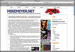 |
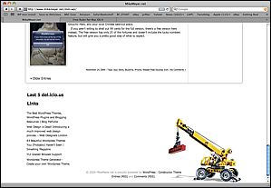 |
Here’s the same theme with a few minor adjustments, mostly different background images and font tweaks:
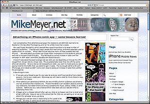 |
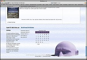 |
I’d spent a bunch of time scratching my head over how I might do something similar to the legos/crane motif. Finally, I found something I could isolate and put into the theme, and just went with a simple photocollage for the header file. I played with a few backgrounds, and decided to go with a bright, fairly neutral glass texture. With a couple hours of Photoshop, now the page looks more like my old one.
And, just for giggles, here’s what my test version of the site looks like with the default WordPress theme. It’s quite boring, and requires you to shove everything off to the left side.
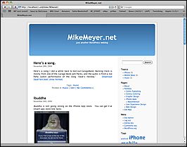
I will say that I am struggling a bit with the flow of the content inside these posts, things really fall apart if you have more than one small graphic, it seems. Perhaps I’m not doing this the easy way, I did see that wordpress has a built-in gallery function for putting a bunch of graphics in a post, but they didn’t look so good to me. Suppose my next step is to RTFM before I blame the theme or WordPress. I also think that my articles are already proving to be too long for the front page, I should use excerpts, but not sure if the theme supports that. At the very least, I may need to override some more things in the style sheet.