People trying BlackBerry 10 for the first time. Sounds like there’s a learning curve for the completely-gesture-based system. Wonder how easy to use it will be once you’ve learned it. Swiping from the bezel onto the screen has become a common enough gesture on mobile that people may get it quickly.
Category: user experience
80 iOS magazine downloads for every 1 Android download, so they are throwing in the towel.
You can’t argue with their logic, but you have to wonder why the big discrepancy.
One area that screams opportunity is that it was taking them about 3-4 extra days to author the magazine for their Android targets, compared to a few hours to adapt their Retina iPad version to non-retina iPad and iPhone versions.
If you have an authoring platform that easily can generate for all the targets without manual intervention, then it really doesn’t matter how small your Android audience starts out. This seems to be the issue, that they built for the retina iPad, then ‘dumbed down’ the content to hit a broad range of Android devices. They use the Mag+ platform to publish their magazine. It starts with InDesign, and maybe that’s part of the problem. There’s a pressing need for a publishing workflow that is more organic to mobile rather than based on print content.
The other issue seemed to be discoverability — there is one place in iOS where Magazines are showcased (Newsstand), and they are also discoverable in the App Store proper. On Android, you have multiple app stores — Google Play, Amazon, and whatever storefront the carriers may have added. This means you need to submit your app to multiple stores and try to get it showcased there. If Apple has 100,000 downloads of your app, it will show up in popularity rankings, but that same 100,000 will be diluted across multiple stores on Android. And given the split they saw, it’s really 1250 downloads spread across Google Play, Amazon, Verizon, etc.
iOS 6 also has a feature that will tell you if there is an app for any sites you visit in Safari, and that certainly must drive downloads as well. The feature is called “Smart App Banners”. You basically put a meta tag in your web page that tells Safari about the app, and voila, a banner with an App Store link is visible to any Safari users using iOS 6. Android doesn’t have a similar feature.
We’ve all been busy with the last-minute shopping, travel, cooking, and hangover cures, so here’s a rundown with lots of “Best Of” lists, predictions, etc. for the end of the year.
This piece from TechCrunch talks about how the lower advertising return on mobile will affect future sites and products.
UX Magazine talks about the top 5 user experience trends in 2012.
Warren Ellis shares his workflow for writing his new novel GUN MACHINE, using an iPad. Apparently you can write a novel on it after all.
BlueStacks is a desktop virtualization app which enables you to run Android applications on OS X or Windows machines.
The creators of Spun, a new news app for iOS, share their tips for creating a great iOS app.
This is a little bit older, but a great analysis of the inter-company politics behind Apple’s decision to drop Google’s Map API.
Ars Technica presents their in-depth review of the new Google Maps app for iOS.
Mashable ran some great advice for media companies on how to adapt or die.
Bad online search practices taken into real-life situations, courtesy of Google.
One of the big benefits to upgrading my laptop to OS X Mountain Lion was the ability to finally have all my contacts, calendars, etc. synced on iCloud. This was a big obstacle for me, I had one Mac on iCloud, but most of my email meeting requests and new contacts coming in through my Snow Leopard machine.
The biggest benefit to making the upgrade, however, is the ability to take advantage of apps that fully embrace iCloud. I’ve been using Realmac’s To-Do List manager Clear for a while on iOS. It’s a stellar app for the job: most iOS To Do list managers are overly-complicated, but Clear just lets you make lists, add items, and delete items. You don’t need to be familiar with GTD (Getting Things Done) or any other methodology. You don’t need to have read a book describing a system, you don’t need to register on a web service to sync with your PC. In fact, up until Version 1.2 of Clear for iOS, there was no desktop syncing, and that was OK, because the app is just so elegant for what it does do.
For those who haven’t used it, Clear is mostly gesture-based — you check off tasks by swiping on the list item, you go up and down the hierarchy of lists and tasks using pinch gestures, you can add an item either with pull to refresh or with an open pinch. All of these actions are accompanied by sound queues, and the task lists are sorted by a gradation in background color. The standard color scheme is a ‘heat-map’ which puts high items in the list in red, and lower items in gradations of orange and yellow. Completed items turn green before they disappear. It’s a very satisfying way to interact with a task list, for those who love the process of checking off their tasks.
RealMac introduced a Mac OS X version of the app in early November 2012, and with this version came an update to the iOS version enabling iCloud as well. The OS X version uses most of the gestures of the iOS version, but adds the ability to look at multiple lists at the same time, and drag tasks from one list to another, and also use keyboard shortcuts for many functions. It’s not a perfect adaptation, some of the gestures are a little clumsy when you do them on a trackpad, but for those familiar with the iOS version, it’s easy enough to adjust. On OS X, the Clear interface is simple, takes up very little screen real estate, and is very handy for jotting down quick lists. On my laptop or desktop, I find myself using it whenever I need to remember a quick list, it’s much more accessible than even Evernote for those ephemeral lists you actually expect to complete.
The big advantage of Clear across the cloud is that iCloud really ties the mobile and desktop versions seamlessly, and in a user-friendly fashion. Whenever you change a list on your handheld or your desktop, you get immediate feedback on that device, but also get audio feedback when the change is propagated through iCloud. It becomes completely obvious when it is or isn’t working. You don’t have to think about it.
This is a great example of the power of iCloud, with a sensible implementation that gives the user good information about what is happening while being completely unobtrusive. I now have these lists synced between my mobile devices and computers at all times, which makes them much more useful.
Clear is currently on sale for Mac OS X for $6.99, which is a great deal over the original price of $14.99. I think it’s normally $9.99 now. Clear for iOS is currently 99 cents.
Getting used to iTunes 11
I’ve had more time to spend with iTunes 11, and have to say that I’m impressed. The new version dramatically simplifies the clutter iTunes has gathered over the years. Most importantly, the new version introduces a new method of managing song playback that makes iTunes much more usable.
However, this refactoring comes with a learning curve. The reorganization is actually pretty logical, but for a long-time user of iTunes, it’s going to take a little mental recalibration to find things.
Note that I’m looking specifically at the iOS version of iTunes 11. Some UI elements may be different on Windows.
Less Clutter, More Focus
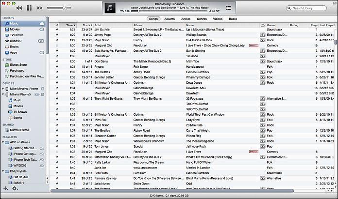
The first thing you’ll notice about the new iTunes is that the sidebars have been eliminated in favor of a segmented control across the top of the window.
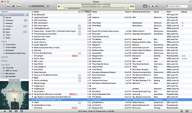
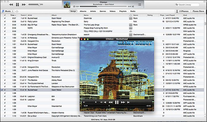
Instead of the old control which let you swap between lists, grids, and cover flow, each of the settings in the segmented control has one view optimized for the type of content being displayed.
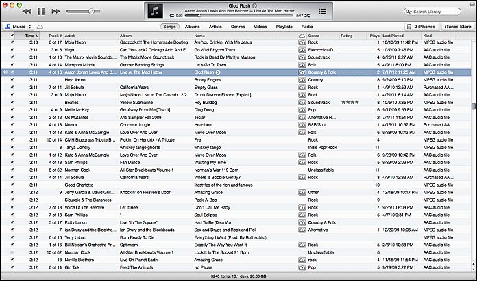
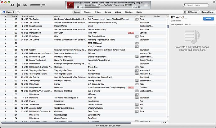
Song view looks relatively unchanged, and the same features for autosizing columns, hiding/showing columns, and dragging and dropping columns into the desired order are still there.
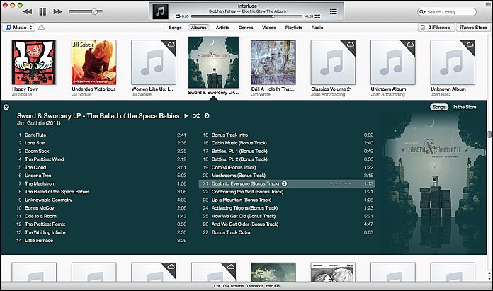
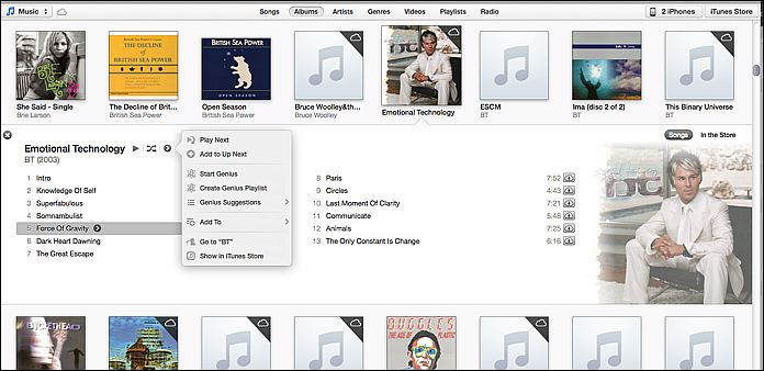
Album view now incorporates album art into the listing, for example. The use of album cover colors to highlight the current album being viewed is both attractive and visually helpful.
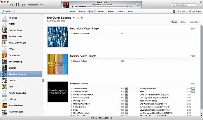
Artist View not only lists content from the artist, but gives you a quick link for finding the artist in the iTunes Store.
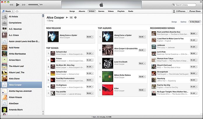
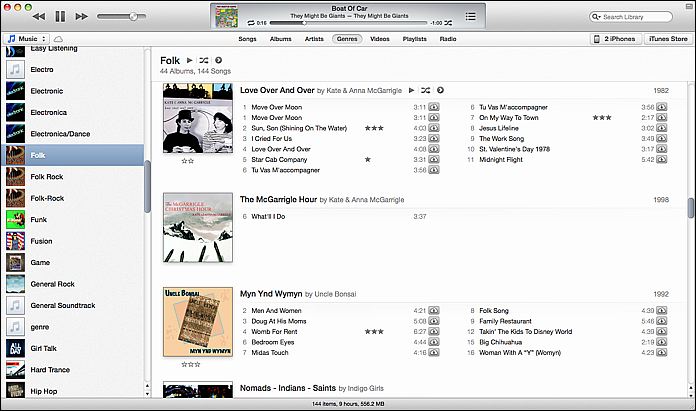
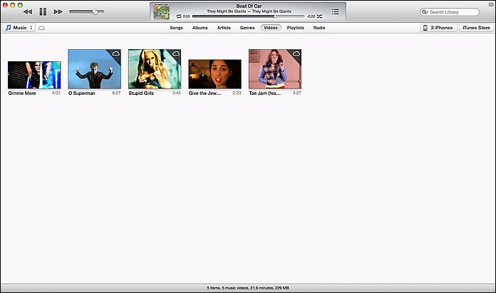
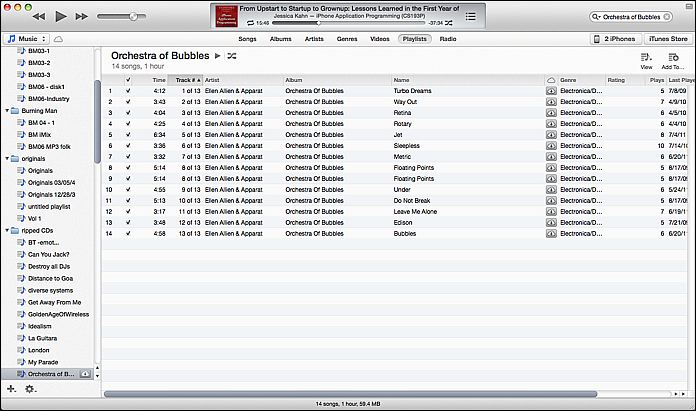
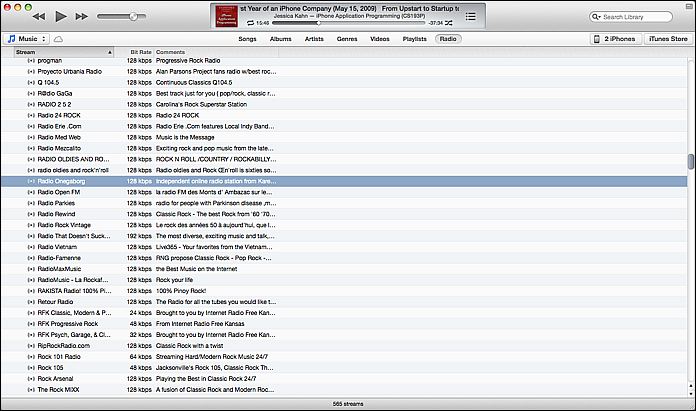
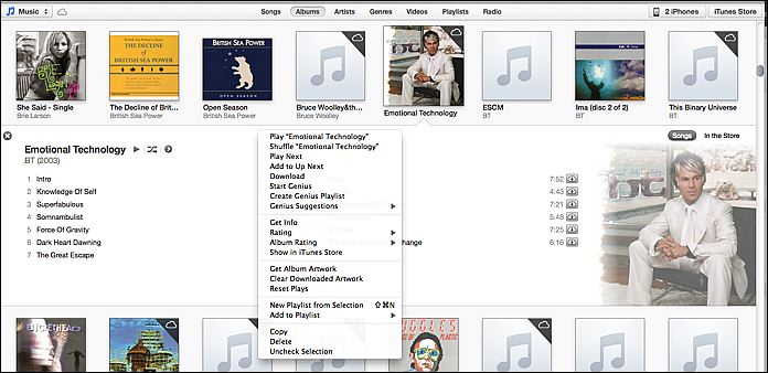
With the exception of the Radio view, most of these views provide both right-click menus and explicit icons for such functions as adding things to play list, toggling shuffle mode, etc.
Playlist Management
With the old sidebar drag and drop no longer available everywhere, playlist management is now a bit harder to find, but logical. Most lists, songs, etc. can be added to an existing playlist via the ‘Add To…’ icon or menu item, which presents a pick list of the playlists.
To start a new playlist from scratch, hit the + icon at the bottom of the sidebar on the playlist view. It’s a little inconsistent to me, but what you use to add songs is the same ‘Add To…’ button.
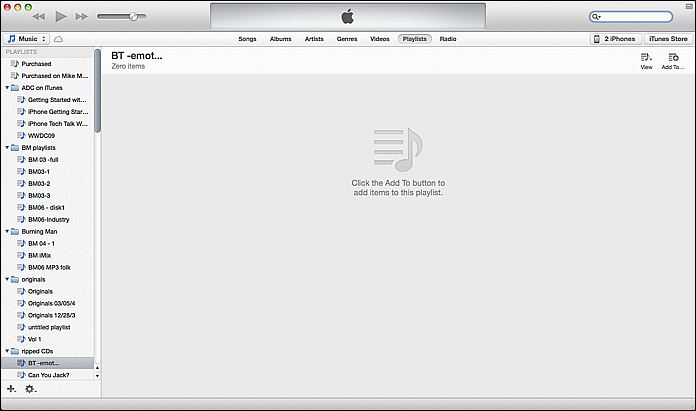
Clicking the Add To button causes the playlist pane to slide to the left and puts you in Song View. Now you can drag and drop songs to your heart’s content. You can drag album covers or song titles from any of the views, you aren’t limited to Song View.
There are alternate ways to get songs onto a playlist as well:
Device Management
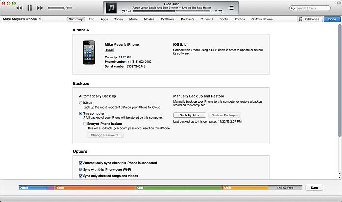
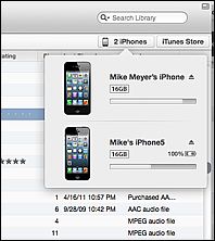
Device management is done in Library mode via a pulldown on the right side of the horizontal navigation bar. This pulldown shows each of the devices connected and charging status for those connected by wire. Clicking on the device gets you the familiar device management page.
“Just make it work the old way.”
If you don’t care for this reorganization, you can make things look mostly like they used to. The traditional iTunes sidebar is still available via the View > Show Sidebar menu item. This disables the modal Show Store/ Show Library button on the horizontal navigation bar and eliminates the device pulldown, but keeps the horizontal segmented control for the different types of content.
Library Mode and Store Mode

iTunes 11’s new interface has two main modes: library mode, and store mode. They are toggled via a button on the right side of the horizontal nav bar. Store mode and Library Mode have distinctly different visual looks: your library has a light background on the nav bar, the store has a dark background. Note that this distinction is valid even if you are running iTunes 11 in the “Classic” show sidebar view.
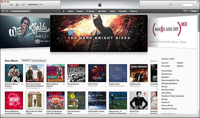
The storefront does add a History pulldown (the button next to the ‘Library’ button) which will show you items that you have browsed recently.
Better control of what you playing
Conceptually, iTunes has always been very playlist-centric, which often would make it hard to know what would be played next when not specifically playing a playlist. This changes somewhat in iTunes 11, though it is easy to overlook at first. Now there is an explicit queue you can use for queueing up your music in advance, called “Up Next.”
Once you know about it, it is a much more intuitive way to schedule playback than the older, more implicit behavior of the playlists. To some extent, this borrows the queue paradigm used by Turntable.fm, but is a much more complete implementation (Turntable lets you add a song to the queue, but always to the topmost next slot).
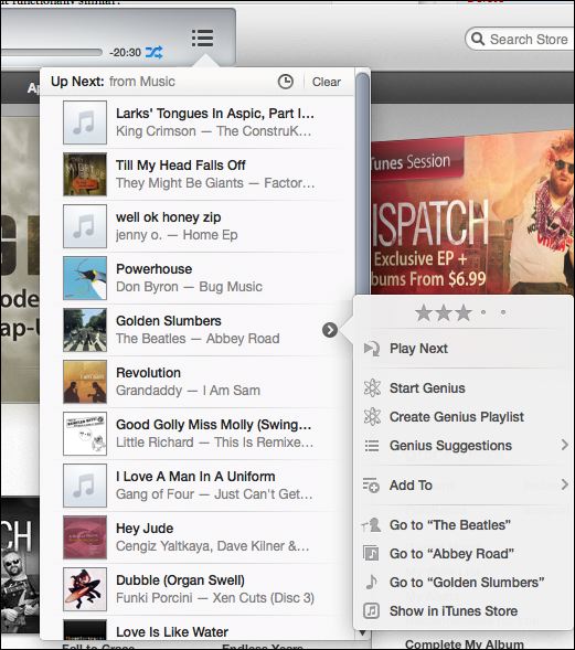
In older versions of iTunes, whatever list of songs was showing in the main window was the queue; the next song to play would depend on where you were browsing at the time and how you had searched or filtered your library. iTunes DJ, formerly ‘Party Shuffle’, was a means of queueing up songs in advance while playing music, but one would have to add the songs they wanted to that playlist, and then arrange them. One needed to be nimble to set up a song as, say, the next one to be played:
- Find song
- Add to iTunes DJ playlist in sidebar
- Go to iTunes DJ playlist
- drag song to next slot in playlist behind currently playing song
“Up Next” changes this paradigm in a subtle but sensible way. You now have a queue of songs that will be played next, and you can simply add a song to the tail of this queue, or add a song to be played next. Right-click and select ‘play next’. The queue can be explicitly viewed on the control area, and can be rearranged via drag and drop. The ‘Play Next’ and ‘Add To Up Next’ functions are available in most menus accessed via the “>” buttons, and via right-click.
Of course, you still have the ability to immediately play a song, and if you haven’t explicitly added anything to the queue, iTunes will play songs much as before, basically using the list you have displayed. You will, however, be able to view this in the Up Next window. Should you be browsing music and decide to immediately play a song while you are playing an Up Next queue, iTunes will warn you and give you the option of clearing the queue or just playing the song and continuing with the queue afterwards. You can add entire albums and playlists to the queue as well.
Improved iCloud support
Whereas the old iTunes made a big deal about iCloud, iTunes Match is no longer spelled out as a separate playlist item. Songs that are on iTunes Match are clearly marked, can be played via streaming, or downloaded to the local machine using the download icon. Device management pages are clear about whether devices are backed up to iCloud.
The MiniPlayer is more powerful
The iTunes mini-player has always been a good way to get iTunes out of the way while working. iTunes 11 takes the mini-player beyond mere deck control (play, pause, skip) and adds Airplay support, search, and the Up Next interface.


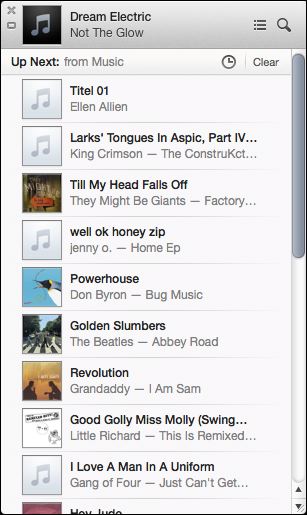
The Up Next icon expands the MiniPlayer into a list view you can edit on-the-fly, bumping songs to the top, searching for new songs or albums to add, and basically the full functionality of the Up Next feature.
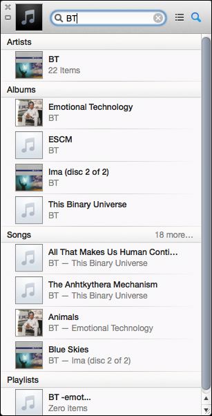
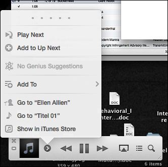
Clicking the Search icon gets you a very smart search which will let you add songs, albums, or playlists to the Up Next. Songs can be prioritized to play next as well.
This version of the mini-player actually takes up less screen space than its predecessor. One way it does this is through the elimination of the visual indicator of playback progress and the volume control. It’s a trade-off I think I can live with — while you can’t see time remaining or control your volume, you can find new songs, set them to play next or arrange them in the queue without leaving the mini-player.
Another difference of note is that the mini-player is no longer accessed via the standard maximize window control, there is a separate icon on the upper right corner of the iTunes interface that does this. Now the standard maximize button toggles full screen mode, bringing iTunes back into compliance with OS X Human Interface Guidelines. The user can now have both the full-sized player and mini-player visible at the same time as well. Option-Command M toggles between the two views.
Quibbles
Such a huge change is not without its quirks and omissions. Apple is apparently working to restore the old ‘Find duplicates’ feature already. Cover Flow is gone and probably not coming back, though even that is not necessarily permanent based on the outcry.
Playlists can’t be opened in separate windows for comparison.
Up Next has a little clock icon which toggles you between playback history and Up Next mode. This is kind of cryptic, though there is a tool tip on the icon. I liked the older iTunes DJ format of being able to scroll back in time before the current song.
Cover Flow, once a much-ballyhooed feature of iTunes, is no longer used. You may or may not miss it; I rarely used it, and in some contexts, like looking at app icons, it was downright silly.
There are sure a lot of ways to add things to playlists now, but starting a playlist is kind of a ride. It’s easy to get confused about what you can do in each context, and you never had to think about this nearly so much in the old sidebar-only, playlist-centric days.
Have Fun
To summarize, iTunes 11 is definitely different, anyone used to the old interface will scratch their head at times. However, the ability to really DJ live with the player is greatly enhanced by the Up Next feature. Up Next is a big improvement, and the new mini-player puts a remarkable amount of power at your fingertips.
This week’s big news on the app side of things was the imminent closure of The Daily, an iPad-only newspaper. I can’t even type in all the links analyzing why this failed, just Google ‘The Daily Closes’, and you’ll see.
Craig Mod, one of the developers of Flipboard, had a very insightful analysis of why News Corp.’s The Daily failed. It all comes down to something he calls ‘subcompact publishing.’
The term has taken off to describe a very nimble approach to magazine publishing on tablets — content-forward, rather than trying to emulate the paper magazine experience. This follow-up article from him summarizes some of the discusssion he’s inspired.
My take on things:
- Stop trying to squeeze a magazine down into a tablet. Tablet software needs to be reductive, think of building the least-instrusive means of getting people to the content.
- There is a serious gap on the authoring side of things, especially if you want a truly cross-platform experience. Any workflow starting with Adobe’s professional publishing tools is going to end up with a heavy, slow, hard-to-use mess on mobile. There is definitely a need for something which makes ‘selling magazines for iPads as easy as blogging.’
I’m not the only one who was a bit put off by Brent Caswell’s iOS lockscreen redesign proposal, which started with the very arguable thesis that iOS is slow and boring, and therefore needed a whole new layer of UI added before you even unlock the phone. Jonathan Sutter also addresses the issue, with some intriguing alternatives. He points out that the purpose of the lock screen is not to display random information, but to avoid butt-dialing. Any information on the screen is gravy at best, but adding additional information from background apps would simply require some modification of the current Date/Time layout, not a whole new set of taps and gestures. Even the current up/down gesture of the camera grabber complicates the screen and undermines the consistency of the UI.
Asymco had a great article about the dangers of outsourcing too much of your manufacturing, with Asus and Dell’s relationship as a cautionary tale.
Apple is assembling some of their new iMacs in the U.S., and Tim Cook hinted that more Macs will be manufactured domestically. This would especially make sense for a new Mac Pro line, and help explain why a case redesign has taken so long. Remember long ago when Tim Cook talked about a pleasant surprise in the Mac Pro line in 2013? The Mac Pro line is the one that relies most on built-to-order manufacturing, so it would be a good fit.
Tim Cook’s interview with Brian Williams this week was very telling about his efforts to run Apple his own way.
T-Mobile, the one US carrier that actually gives you a plan discount for using an unsubsidized phone, is doing away with phone subsidies entirely. Just in time for them to introduce the iPhone on their network.
Square has just announced support for Apple’s Passbook feature, and for gift cards.
