Categories
Blog Mobile News user experience UX

Mobile Links for Dec 2-9 2012

This week’s big news on the app side of things was the imminent closure of The Daily, an iPad-only newspaper.  I can’t even type in all the links analyzing why this failed,  just Google ‘The Daily Closes’, and you’ll see.

Craig Mod, one of the developers of Flipboard,  had a very insightful analysis of why News Corp.’s The Daily failed.   It all comes down to something he calls ‘subcompact publishing.’

The term has taken off to describe a very nimble approach to magazine publishing on tablets — content-forward, rather than trying to emulate the paper magazine experience.   This follow-up article from him summarizes some of the discusssion he’s inspired.
My take on things:

  1. Stop trying to squeeze a magazine down into a tablet.  Tablet software needs to be reductive, think of building the least-instrusive means of getting people to the content.
  2. There is a serious gap on the authoring side of things, especially if you want a truly cross-platform experience.  Any workflow starting with Adobe’s professional publishing tools is going to end up with a heavy, slow, hard-to-use mess on mobile.  There is definitely a need for something which makes ‘selling magazines for iPads as easy as blogging.’

I’m not the only one who was a bit put off by Brent Caswell’s  iOS lockscreen redesign proposal, which started with the very arguable thesis that iOS is slow and boring, and therefore needed a whole new layer of UI added before you even unlock the phone.   Jonathan Sutter also addresses the issue, with some intriguing alternatives. He points out that the purpose of the lock screen is not to display random information, but to avoid butt-dialing. Any information on the screen is gravy at best, but adding additional information from background apps would simply require some modification of the current Date/Time layout, not a whole new set of taps and gestures.  Even the current up/down gesture of the camera grabber complicates the screen and undermines the consistency of the UI.

Asymco had a great article about the dangers of outsourcing too much of your manufacturing, with Asus and Dell’s relationship as a cautionary tale.

Apple is assembling some of their new iMacs in the U.S., and Tim Cook hinted that more Macs will be manufactured domestically.   This would especially make sense for a new Mac Pro line, and help explain why a case redesign has taken so long.  Remember long ago when Tim Cook talked about a pleasant surprise in the Mac Pro line in 2013?  The Mac Pro line is the one that relies most on built-to-order manufacturing, so it would be a good fit.

Tim Cook’s interview with Brian Williams this week was very telling about his efforts to run Apple his own way.

T-Mobile, the one US carrier that actually gives you a plan discount for using an unsubsidized phone, is doing away with phone subsidies entirely. Just in time for them to introduce the iPhone on their network.

Square has just announced support for Apple’s Passbook feature, and for gift cards.
Categories
Blog user experience UX

A use for Safari’s “Reading List” feature

Duh, I can’t believe it took me this long to realize it, but Safari’s ‘Reading List’  is the perfect way to temporarily bookmark news stories for blog links.

This is going to dramatically decrease the time I spend making my mobile link posts.   Browse, open Reading List sidebar,  hit ‘Add Page’ for any article you want to read in more detail later or link to.   No more ‘where did I see that cool article about Samsung spending so much on advertising?’.   When done with the articles, remove them from the reading list.

It’s much more accessible than the usual browser bookmarking function, and ideal for bookmarks you only need for a short period.   Come to think of it, this may have inspired the ‘Up Next’ behavior in iTunes 11.     Here’s Apple’s instructions on how to use it.

Update:  Safari Reading List is stored on iCloud, so is accessible across all your devices, which is even better.  I can bookmark while curled up with my iPad, then collect the links on my desktop.

Categories
Blog iOS development user experience UX

Thoughts about the iOS lockscreen.

Brent Caswell has an interesting proposal for enhancing iOS’ lock screen making the rounds (via Gruber and Dalrymple) today.

It looks very consistent, but seems a bit fiddly. The minute you have more than one of these lockscreen cards, you have too much swiping and too many decisions to make, and this before you unlock your phone. It’s certainly not the ‘glance and go’ promised by Windows Phone.

It’s going to be hard to change the iOS lockscreen after 5 years, it’s become iconic to the brand, so Apple is going to be very cautious. I could see them doing something like this precisely because it doesn’t change the screen. I feel if you have to do anything more than wake the phone up, you’ve failed.

I can get the time at a glance. Anything more than that, and I’m wrapping my car around a tree. That’s my use case for information on the lockscreen. Windows Phone moves more in the right direction, but their asthetic choice of the Metro look makes it harder to pick out information. It’s like having 5 red and white parking signs on the same pole. Each have similar visual weight, and you end up paying too much attention to the phone. Android Live Wallpapers seem too heavy in both information and processing.

A passively scrolling version of the above proposal might work, as long as bites of information transition quickly enough that you aren’t looking at your phone for a long time and the content requires minimal reading. And you probably shouldn’t have more than 2 of these screens alternating, or you will be looking at the phone for too long. The key is that you are getting the information passively — if you need to interact, you should probably unlock the phone.

It’s all about meeting the ‘don’t die in traffic’ test.

Categories
social shopping user experience UX

Update: Changing font size in iTunes 11

Changing font size on iTunes 11

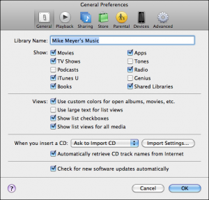
Fernando Alves points out that iTunes 11 does have a means of increasing the font size.   To increase the font size used in lists, check the “Use Large Text for List Views” option.

Note that there is only one large text font and the standard font, there is no fine control of font or font size. This option also only changes the font size of the list-oriented screens (Songs, Playlists) and not the other display options (Genres, Artists, Albums).

Using the alternative font doesn’t really change the row height in these tables, so the end result seems a little crowded, but at least the text is bigger.

Categories
iOS development iPhone Mobile News social shopping user experience UX

Mobile Links for week of November 25-30 2012

Android shopping traffic lags behind iOS, despite the larger number of devices. GigaOm asks why:
Why are Android users less engaged than iOS users?

Nice detailed graphs and links to several good stories on the topic. I do take issue slightly with the idea that “willingness to buy stuff == engagement”; everyone buys devices for different reasons. But if you are writing shopping apps or marketing your business on mobile devices, it’s important to understand the different types of users and the strategies that work best on each platform.

IDC: Developer Disinterest Could Kill RIM & Windows Phone Ya think? Out of all of the companies I’ve interviewed lately, only a couple are planning to put their apps on Windows Phone, and nobody is planning to support BlackBerry.

11 Apple iPads per hour vs. zero Microsoft Surface tablets Schadenfreude aside*, this is a significant indicator about what a misstep it has been for Microsoft to sidestep its OEMs.  They don’t have nearly the distribution network they need to go it alone.   Also, Surface exemplifies how badly MS has misread the tablet trend; it’s not about the hardware, its about reducing the computing experience to something that is quick and pleasurable.  Shoehorning desktop Windows onto a tablet barely capable of running it fails both tests.

*Actually, I’m not enjoying this at all,  I’m a Microsoft shareholder, and my investment has seen no growth, while my Apple stock has gone through the roof.  Steve Ballmer has got to go.

In BII MOBILE INSIGHTS: Mobile Technology May Define The Future Of Healthcare, PriceWaterhouse Coopers presents a video talking about how mobile is influencing healthcare.      The other links/reports on this page are pretty good, too.

Categories
user experience UX Web Design

iTunes 11: First impressions

Very First impression: More pictures, Tinier fonts that cant be resized.

While the new font is fairly readable, the smaller size is a bit of an insult for my aging eyes. Not cool, and not changeable, as far as I can see.

At first, it looks like the navigation is very different, the sidebar that has been with us since iTunes 1 is gone, replaced by a ribbon which lets you choose content types and view a dropdown of your devices. Turns out that you can still turn on the sidebar, it’s an option in the View menu.

iTunes Match came up pretty quickly, and is no longer called out in the sidebar list. Device management features seem to be working better with my iPhone 5.

I’ve left my desktop with the old version and will post any interesting comparisons I find.

I have noticed some glitches in the way some of the screens load, where the HTML 5 layouts are either messed up or text fields are displaying with strings like “DI6.SortOrder.Featured” instead of the title “Featured”. I”m wondering if some instances of the servers are not syncd up. Apple runs iTunes on tens of thousands of servers, and restarting them for updates is not an instantaneous process.

Edit: Gruber has a pretty good summary of the new interface already.