Categories
Blog Web development

WordPress 3.5 released.

WordPress 3.5 released yesterday. This looks like a big update, with better media handling capabilities.

I could have really used better media handling capabilities to do the iTunes 11 article — getting screenshots into my current WordPress version was tedious and error-prone.

I’m using version 2.8.2 of WordPress currently, so the update is long overdue.  However, since this is a big point release, it may make sense to wait on 3.5.1 for bug fixes.  This is the eternal dilemma with maintaining your own WordPress site — do I need to install the new version that just came out, or can I wait?    Clearly, I’ve waited too long to embrace 3.x, which has better tools and improved architecture, as well as better mobile support.

Not everyone has this issue — you automatically have the latest and greatest if you have a WordPress.com site,  and web hosts now are supporting it. My Web host has an option for auto-installing it (and other popular open-source packages like PhpBB) that keeps it up to date, for an additional $3 a month.  WordPress also has the feature to update from the admin panel, but that requires your hosting service to support it, and you to set up certain permissions that may be a security risk.   I wouldn’t depend on this feature for a major update like this anyway, the database migration is risky, but it would be great for updating a minor version change.

Look for some changes as I update the site.  It’s pretty likely I”ll need to re-think the site theme (skin), the plug-ins I use, and the content that I expose via widgets.   WordPress widgets have gotten much better since this version — WordPress.com, for example, supports several new widgets that can be put on your sidebars, such as Twitter feeds.

I’m hoping that the authoring workflow is better.  I like the WordPress post editor overall, but it does have room for improvement.  The 2.8 version is pretty clunky if your post is longer, and working with media is awkward.  I’ve been considering using BBEdit to do my writing and just pasting things in, but that isn’t nearly as convenient as just logging in from a web browser, writing a post and hitting Publish.

Categories
Blog iPhone Mobile News Web development

Blackberry enters the Tablet race

Blackberry announced their Tablet today:

http://www.macrumors.com/2010/09/27/research-in-motions-7-inch-playbook-tablet-to-target-business-users/

Of course, it connects seamlessly to all the BlackBerry web services, has a webkit browser, multitasking, etc. Not sure what the connectivity is, rumor had it as something that tethered to a Blackberry handset rather than having its own cell radio. Definitely aimed at Enterprise market. No pricing announced yet,

More info on Engadget.com, including some pics from the RIM conference.

The demo video is fairly interesting, they appear to have cribbed a lot of UI concepts from Palm’s WebOS. All in all, it looks like a good offering; if you look at it as sort of an accessory to one’s Blackberry, it could get a lot of traction amongst Enterprise customers, even if the Blackberry app store doesn’t expand dramatically.

As a comparison, here’s the 7 inch Galaxy Tab:

This Official Samsung Galaxy Tab Video Demo Is A Nine Minute, Must-Watch Snooze Fest

They have borrowed liberally from iOS user inferface concepts, and the device does appear to be very responsive. What they don’t talk about is the price. Of course, there are a lot of questions about app availability as well, most Android Market apps will need rewriting to use the unique screen size, and it’s not clear it will have Android Market.

This video of a prototype HP Windows 7 tablet does not bode well for Microsoft at all:

Hp Slate review

Based on how sluggish the UI is, how many buttons the device requires to support Windows (a Ctrl-Alt-Del key? Really?), and the obvious lack of touch integration in the OS ( you have to press a button to make the keyboard appear for text input) this device is too little, too late.

Personally, I don’t think the 7 inch devices will prove to be a big hit. You are talking about a device that’s bigger than a phone, but smaller than a paperback book. While it can support the split-view type interfaces we’re seeing on the iPad and in Sencha, they’re still kind of small for displaying a lot of information. The larger screen of the iPad is just a lot more real estate for displaying information, and given the limitations of the touchscreen input resolution, gives you a fairly precise pointing mechanism at a low price point.

I don’t buy the rumors that Apple is going to introduce a 7 inch iPad, their decisions for the size and form factor for the first-gen device were not arbitrary. At its current size, the iPad’s screen is small enough to be a portable device (think replacement for a clipboard), but large enough to display lots of information and allow for very immersive UI interactivity.

Prcing is going to be an issue for all of these. With the current benchmark being $499 for the entry level iPad, there just isn’t a lot of room for price competition, especially since analysts believe that Apple could drop the price by $100 or more and still turn a profit. Right now, the phone-call-enabled European version of the Galaxy Tab is said to be priced at 700 or 800 Euros, or 679 British pounds. With contract, this is going to be lower, but who wants to commit to a multiyear contract for a device that is more of an accessory than a primary device like a laptop?

Hope that HP unveils their WebOS tablet soon, I assume it will hit much closer to the mark than the Slate, which appears to have been cancelled for a very good reason.

Categories
iOS development iPhone Web Design Web development

WPtouch is an awesome way to get your blog on the iPhone

Since I’ve been studying how to optimize web pages for the iPhone, I decided to quit procrastinating and finally install WPTouch, a WordPress plug-in that generates a very iPhone-friendly version of your WordPress Site.IMG_0108

WPTouch provides some very elegant UI attributes, including a search panel that slides in, Google Adwords for Mobile support, and the whole presentation is very configurable. Also, you have a switch that will let you go to and from the standard browser layout, so you aren’t stuck with the theme. WP Touch is considered a theme, but is installed as a WordPress plug-in, since it has to inject some code into your pages in order to do the theme-swapping.

Mike-icon-snapshot
Obey the foot. See how happy it will make him?

So, you may be asking, “how do you get one of those neat-o icons that you can put on your iPhone home screen to jump directly to the web site?”
This blog post has a great tutorial of how to set up your icon app if you are using the plug-in. Normally in a static web site, you just create a 57×57 pixel PNG file and name it icon.png, and link to it in your HTML header:


Oddly enough, the apple-touch-icon link is not part of standard wordpress themes in general. I guess that’s not so weird considering the themes are designed for desktop rather than mobile, but it is annoying that the iPhone plug-in can do this but the standard view of the site can’t be saved with your custom icon to the iPhone home page.

I’m looking forward to seeing how this mobile page looks on other devices, apparently the user agent sniffing done by the plug-in can also supply the page for Blackberry, Android, and others.

Categories
iOS development iPhone Mobile News Web Design Web development

iPhone Web Apps versus Native Apps

Elisabeth Ronson from O’Reilly just started a new webinar class today through creativetechs.com, called “Learn to Build iPhone Web Apps.

It’s not too late to sign up, it’s a 2 hour webinar every Tuesday at 11am PST. Viewing the webinar is free, and the course videos can be purchased at a nice price if you are enrolled now. Find more info here. The first class was today, but that was more an overview, so you could easily jump in on the next session.

One thing that Elisabeth touched on that I think needs more amplification is the question “When should I consider a Web App, and when must I build my App natively?” It turns out that for many types of informational apps, a Web App makes a whole lot of sense, and few people realize just how powerful the iPhone browser is.   So many people who want iPhone apps for their businesses or services could actually get by very nicely with a well-written Web App, it’s just that there isn’t much awareness of that option, and there aren’t a lot of designers who are savvy about Safari’s Webkit/HTML5 features.

You *can* build a web app that:

  • Has a tab bar interface to separate sections of the app.
  • Can play video.
  • Can use the accelerometer.
  • Can accept simple gestures, like a swipe.
  • Can animate UI display and interaction (acceleration, crossfades, etc.)

You *must* build a native app if your app:

  • Needs to be able to run standalone without a data connection.
  • Uses the iPhone camera for stills or video.
  • Is intended to be sold on the App Store, and/or has additional content you want to offer through the App Store.
  • Requires more sophisticated animation than WebKit provides, or uses OpenGL.
  • Has complex gesture interactions.

If your app can be done as a web app instead of a native app, you get some immediate benefits:

  • You don’t need an Apple developer’s account to develop your app.
  • You don’t have to go through the app store approval process to publish your app.
  • You don’t have to go through the app store approval process to update your app.
  • Apple is not going to stop offering your app.
  • You have a very wide range of CSS/HTML tools to choose from to do your development, and a large base of people who know CSS.
  • You can push changes to your content, pages, etc. in real time.
  • May also run on other WebKit mobile devices.  Note that Palm, Android, certain Nokia phones, and certain Blackberries all have Webkit browsers.

More on this subject as the class goes on.

Categories
Web Design Web development

Theming WordPress plug-in content

I have to say that I really like the delicious plugin (del.icio.us for WordPress, by Ricardo Gonzalez), but it didn’t quite look right in the Constructor theme that I am using. The heading didn’t match the rest of the theme headings, and there was text following the link names specifying when the link was posted, but it was indistinguishable, i.e. same style.

(Delicious.com, or del.icio.us,  is a social bookmark site, you can save bookmarks to the cloud and share them with your friends.  You tag the links, they’re searchable, your list of links is browsable, and the ability to access that cloud on your blog is a great little feature.)

Turns out when you look at the source code generated by the widget, it does have custom classes for these elements:

Delicious_title_link   -- the actual title used in the sidebar
Delicious-item    	--  the specific link list item
Delicious-link     -- the link itself
Delicious-timestamp  -- the time for the item (e.g. “36 mins ago”)

Fortunately, Constructor lets you add your own CSS rules to the theme in a separate CSS file that won’t be overwritten when you update the theme files. This is a great place for adding the rules you need.

So, I added the following to the css file, just to differentiate that time stamp with smaller italic text in a contrasting color, and to make the title link look like the other sidebar headings:

.delicious-timestamp {
font-size: smaller;
font-style: italic;
color: #2F608A
}

.delicious_title_link {
color: #2F608A;
}

Voila, now things match, and if I should build my own custom theme from scratch later, I can just lift these rules to accommodate that widget, or any other widgets with their own CSS classes.

Categories
Blog Web Design Web development

Theming WordPress – work in progress

Still working on theming the site and installing the plug-ins I want.

I ended up selecting the theme Constructor for now, which looks relatively nice out of the box.  The theme supports several different layouts, and lets you customize a lot of things.

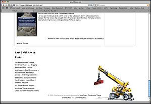
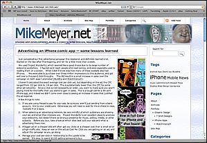
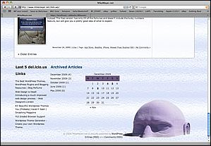
StockConstructorSkin StockConstructorSkin2

Here’s the same theme with a few minor adjustments, mostly different background images and font tweaks:

MyConstructorSkin1 MyConstructorSkin2

I’d spent a bunch of time scratching my head over how I might do something similar to the legos/crane motif. Finally, I found something I could isolate and put into the theme, and just went with a simple photocollage for the header file. I played with a few backgrounds, and decided to go with a bright, fairly neutral glass texture. With a couple hours of Photoshop, now the page looks more like my old one.

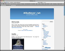
And, just for giggles, here’s what my test version of the site looks like with the default WordPress theme.  It’s quite boring, and requires you to shove everything off to the left side.

Boring. The only thing you can change visually is the color of that blue bar at top, you can't even just drop in your own header graphic.

I will say that I am struggling a bit with the flow of the content inside these posts, things really fall apart if you have more than one small graphic, it seems. Perhaps I’m not doing this the easy way, I did see that wordpress has a built-in gallery function for putting a bunch of graphics in a post, but they didn’t look so good to me. Suppose my next step is to RTFM before I blame the theme or WordPress. I also think that my articles are already proving to be too long for the front page, I should use excerpts, but not sure if the theme supports that. At the very least, I may need to override some more things in the style sheet.