Categories
Blog Cool Apps Mobile News

My 5 favorite iOS apps of 2012, and some disappointments

SafariScreenSnapz001

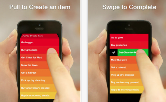
RealMac Software’s Clear, introduced a fun, minimalist to-do-list manager that you’ll actually use.   As an added bonus,  version 1.2 includes iCloud syncing, and there’s a companion desktop OS X version as well.   The gesture-based interface is easy to learn, fun to use, and includes very satisfying use of color and sound to reward you for washing the dishes, feeding the cat, etc.

Clear's gesture-based interface makes it fun to check off your chores.

This is hands-down my favorite app purchase of the year,  an app I use nearly every day, and one only made better with the addition of iCloud.

Flickr came out with a major update that puts it back into play after being overshadowed by upstarts such as Instagram.

Sketch Club: This inexpensive, but powerful drawing program has had several important features added this year: improved brush handling, the ability to record your drawing process, and improved sharing features.  Add in the online community with the app, and it’s a great buy at $2.99.

Propellerhead Figure: Sure, it’s just kind of a toy compared to the excellent desktop music package Reason, but man is it fun, and the music engine underneath sounds great.   This has also evolved new features since its launch, like export of sound files.    I’ve spent 99 cents on worse apps, including my own.   I hope that Propellerhead extends their line to make other apps of this type, perhaps something more like a sketchpad for capturing music.

Evernote 5.0: Evernote gave its app quite an overhaul on both desktop and mobile.  While the redesigned desktop client seems to make a bunch of commands much harder to use, the mobile version is much more streamlined and polished.

Hall of Meh:

Google Maps: The UI is not nearly as intuitive as the old Apple-developed Maps app, the typography and layout stick out like a sore thumb, and the app asking for you to sign in with your Google identity doesn’t serve any purpose that helps you.  Lack of address book support is a big step backwards, too. You may find it a must-have app, particularly if Apple Maps isn’t working well for you, but it really seems like a half-hearted effort from Google.

Paper (iPad only): Sure, it’s gorgeous, but its sketchbook UI paradigm gets in the way fast.  The pens are responsive and aesthetically pleasing, but the pricing model of purchasing them individually at $1.99 makes this a very expensive drawing program considering its limitations.  The lack of being able to pinch to zoom on the pages, along with the lack of layer support, make this package pretty much useless for anything but simple doodles.  Also, the reliance on gestures makes it less intuitive than you’d think.

Facebook: While getting rid of their HTML5-based mistake was a good step in the right direction, the new version still lacks the elegance of the original native version, and the addition of advertising that can’t be filtered out only serves Facebook’s bottom line, not the user.

Categories
Blog Mobile News user experience UX

Mobile Links for the end of the year

We’ve all been busy with the last-minute shopping, travel, cooking, and hangover cures, so here’s a rundown with lots of “Best Of” lists, predictions, etc. for the end of the year.

This piece from TechCrunch talks about how the lower advertising return on mobile will affect future sites and products.

UX Magazine talks about the top 5 user experience trends in 2012.

Warren Ellis shares his workflow for writing his new novel GUN MACHINE, using an iPad. Apparently you can write a novel on it after all.

BlueStacks is a desktop virtualization app which enables you to run Android applications on OS X or Windows machines.

The creators of Spun, a new news app for iOS, share their tips for creating a great iOS app.

This is a little bit older, but a great analysis of the inter-company politics behind Apple’s decision to drop Google’s Map API.

Ars Technica presents their in-depth review of the new Google Maps app for iOS.

Mashable ran some great advice for media companies on how to adapt or die.

Bad online search practices taken into real-life situations, courtesy of Google.

Categories
Cool Apps user experience UX

Managing to-do lists with Clear and iCloud

One of the big benefits to upgrading my laptop to OS X Mountain Lion was the ability to finally have all my contacts, calendars, etc. synced on iCloud. This was a big obstacle for me, I had one Mac on iCloud, but most of my email meeting requests and new contacts coming in through my Snow Leopard machine.

The biggest benefit to making the upgrade, however, is the ability to take advantage of apps that fully embrace iCloud.      I’ve been using Realmac’s To-Do List manager Clear for a while on iOS.   It’s a stellar app for the job:  most iOS To Do list managers are overly-complicated, but Clear just lets you make lists, add items, and delete items.  You don’t need to be familiar with GTD (Getting Things Done) or any other methodology.  You don’t need to have read a book describing a system,  you don’t need to register on a web service to sync with your PC.   In fact, up until Version 1.2 of Clear for iOS, there was no desktop syncing, and that was OK, because the app is just so elegant for what it does do.

For those who haven’t used it, Clear is mostly gesture-based — you check off tasks by swiping on the list item, you go up and down the hierarchy of lists and tasks using pinch gestures,  you can add an item either with pull to refresh or with an open pinch.  All of these actions are accompanied by sound queues, and the task lists are sorted by a gradation in background color.  The standard color scheme is a ‘heat-map’ which puts high items in the list in red, and lower items in gradations of orange and yellow.  Completed items turn green before they disappear.   It’s a very satisfying way to interact with a task list, for those who love the process of checking off their tasks.

RealMac introduced a Mac OS X version of the app in early November 2012, and with this version came an update to the iOS version enabling iCloud as well.    The OS X version uses most of the gestures of the iOS version, but adds the ability to look at multiple lists at the same time, and drag tasks from one list to another, and also use keyboard shortcuts for many functions.  It’s not a perfect adaptation, some of the gestures are a little clumsy when you do them on a trackpad, but for those familiar with the iOS version, it’s easy enough to adjust.    On OS X, the Clear interface is simple, takes up very little screen real estate, and is very handy for jotting down quick lists.  On my laptop or desktop, I find myself using it whenever I need to remember a quick list, it’s much more accessible than even Evernote for those ephemeral lists you actually expect to complete.

The big advantage of Clear across the cloud is that iCloud really ties the mobile and desktop versions seamlessly, and in a user-friendly fashion. Whenever you change a list on your handheld or your desktop, you get immediate feedback on that device, but also get audio feedback when the change is propagated through iCloud.  It becomes completely obvious when it is or isn’t working.  You don’t have to think about it.

This is a great example of the power of iCloud, with a sensible implementation that gives the user good information about what is happening while being completely unobtrusive.  I now have these lists synced between my mobile devices and computers at all times, which makes them much more useful.

Clear is currently on sale for Mac OS X for $6.99, which is a great deal over the original price of $14.99.  I think it’s normally $9.99 now. Clear for iOS is currently 99 cents.

Categories
Blog

The blog experiment so far…

Around the end of November, I decided to relaunch my blog and see what would happen if I actually updated as close to daily as I could.

It’s been about a month so far, and I’m fairly pleased with the results.   Visits and page views are climbing, and at least one of my articles has had over 800 hits, due to search relevance.    My bandwidth usage is actually lower now since I removed some mp3 files from my site that aren’t even linked to these pages — apparently there are a lot of spiders finding all the mp3s out there, so some of my music has been linked from a number of mp3 sites.  Traffic has doubled over October, even considering the mp3 files that I removed, which were Christmas mashups that got 3000 hits each in the 2 days in December I had them up.

It’s taking a while to get a rhythm going.  It’s now been 2 weeks since my last update,  which is a bit disappointing but I have some excellent excuses, like updating my laptop to OS X Mountain Lion and finally getting all my devices synced properly through iCloud.  And then there were job interviews.   The fun thing is that all of these occurrences have inspired me with topics for future posts.    My last post, the announcement of WordPress 3.5, has opened a can of worms — my upgrade process is going to be non-trivial, so I should have a lot to share as it goes.

My first long-form article, the iTunes 11 review, took days to complete, while I’ve been able to get out a number of short useful articles in no time at all.   A lot of this has to do with the workflow behind collecting links and using screen grabs.  I have made some strides in collecting links, but am still having some issues with my workflow for media.   I am hoping the WordPress 3.5 authoring tools will improve this, soon as I do the update.

I’m not expecting to build an audience overnight, it’s going to take time, and more compelling content, but I’m optimistic that things will grow.

Some insights I’ve gotten so far:

  1. Regular updates are really important, both for getting return views and for maintaining creative momentum.
  2. For a blog like mine, it’s important to mix it up between bite-sized posts and longer-form articles.   Holding off for 5 days to finish a long story doesn’t help you be a daily resource for people.
  3. Longer form articles can take a lot of time to research, fact-check, and do screen captures.  You need to nail down a workflow that won’t get in your way, especially for your screen captures, which often will need annotations.
  4. Relevant post titles and content will get you good search engine placement.  The most popular article so far in December was ‘changing font size in itunes 11’, which was also the search term.  You just have to title and write your posts clearly to get this benefit.
  5. Analog seems like a more detailed web statistics package, but I’m not sure it’s more useful than Webalyzer.  I will probably switch back soon.  Whichever you use, seeing the needle move day to day based on your posts is a powerful motivator.
  6. It’s not cheating to blog about process.  Really.

Let’s see what Month 2 brings.

Categories
Blog Web development

WordPress 3.5 released.

WordPress 3.5 released yesterday. This looks like a big update, with better media handling capabilities.

I could have really used better media handling capabilities to do the iTunes 11 article — getting screenshots into my current WordPress version was tedious and error-prone.

I’m using version 2.8.2 of WordPress currently, so the update is long overdue.  However, since this is a big point release, it may make sense to wait on 3.5.1 for bug fixes.  This is the eternal dilemma with maintaining your own WordPress site — do I need to install the new version that just came out, or can I wait?    Clearly, I’ve waited too long to embrace 3.x, which has better tools and improved architecture, as well as better mobile support.

Not everyone has this issue — you automatically have the latest and greatest if you have a WordPress.com site,  and web hosts now are supporting it. My Web host has an option for auto-installing it (and other popular open-source packages like PhpBB) that keeps it up to date, for an additional $3 a month.  WordPress also has the feature to update from the admin panel, but that requires your hosting service to support it, and you to set up certain permissions that may be a security risk.   I wouldn’t depend on this feature for a major update like this anyway, the database migration is risky, but it would be great for updating a minor version change.

Look for some changes as I update the site.  It’s pretty likely I”ll need to re-think the site theme (skin), the plug-ins I use, and the content that I expose via widgets.   WordPress widgets have gotten much better since this version — WordPress.com, for example, supports several new widgets that can be put on your sidebars, such as Twitter feeds.

I’m hoping that the authoring workflow is better.  I like the WordPress post editor overall, but it does have room for improvement.  The 2.8 version is pretty clunky if your post is longer, and working with media is awkward.  I’ve been considering using BBEdit to do my writing and just pasting things in, but that isn’t nearly as convenient as just logging in from a web browser, writing a post and hitting Publish.

Categories
Blog Music user experience UX

Getting used to iTunes 11

I’ve had more time to spend with iTunes 11, and have to say that I’m impressed. The new version dramatically simplifies the clutter iTunes has gathered over the years. Most importantly, the new version introduces a new method of managing song playback that makes iTunes much more usable.

However, this refactoring comes with a learning curve.  The reorganization is actually pretty logical, but for a long-time user of iTunes, it’s going to take a little mental recalibration to find things.

Note that I’m looking specifically at the iOS version of iTunes 11. Some UI elements may be different on Windows.

Less Clutter, More Focus

The first thing you’ll notice about the new iTunes is that the sidebars have been eliminated in favor of a segmented control across the top of the window.

iTunes 10 Layout
The old iTunes layout put everything in the sidebar,
iTunes 11 Layout
The new layout uses a horizontal segmented control instead of the sidebar. Cover art is now in the player display, but can be maximized by clicking on the thumbnail image.

Instead of the old control which let you swap between lists, grids, and cover flow, each of the settings in the segmented control has one view optimized for the type of content being displayed.

iTunes11SongView
iTunes 11 Song View

Song view looks relatively unchanged, and the same features for autosizing columns, hiding/showing columns, and dragging and dropping columns into the desired order are still there.

iTunes 11 Album View

Album view now incorporates album art into the listing, for example. The use of album cover colors to highlight the current album being viewed is both attractive and visually helpful.

AiTunes 11 Artist View
iTunes 11 Artist View

Artist View not only lists content from the artist, but gives you a quick link for finding the artist in the iTunes Store.

Additional items from the artist, and other recommendations are one click away in Artist View.
iTunes 11 Genre View
iTunes 11 Video View
iTunes 11 Playlist View
iTunes 11 Radio View

With the exception of the Radio view, most of these views provide both right-click menus and explicit icons for such functions as adding things to play list, toggling shuffle mode, etc.

Playlist Management

With the old sidebar drag and drop no longer available everywhere, playlist management is now a bit harder to find, but logical.  Most lists, songs, etc. can be added to an existing playlist via the ‘Add To…’ icon or menu item, which presents a pick list of the playlists.

To start a new playlist from scratch, hit the + icon at the bottom of the sidebar on the playlist view.  It’s a little inconsistent to me, but what you use to add songs is the same ‘Add To…’ button.

The "Add To.." button is used to start the playlist building process.

Clicking the Add To button causes the playlist pane to slide to the left and puts you in Song View.  Now you can drag and drop songs to your heart’s content.  You can drag album covers or song titles from any of the views, you aren’t limited to Song View.

Creating a playlist.
Creating a playlist. Once you've clicked the 'Add To' button, you get this view.

There are alternate ways to get songs onto a playlist as well:

Most types of content have an 'Add To' function that lets you insert them into playlists.
The Add To function can be used via click on the ">" icons or right-click.

Device Management

Device management is done in Library mode via a pulldown on the right side of the horizontal navigation bar.  This pulldown shows each of the devices connected and charging status for those connected by wire.   Clicking on the device gets you the familiar device management page.
iTunes11DeviceList

iTunes11DevicePage

“Just make it work the old way.”

If you don’t care for this reorganization, you can make things look mostly  like they used to.  The traditional iTunes sidebar is still available via the View > Show Sidebar menu item.  This disables the modal Show Store/ Show Library button on the horizontal navigation bar and eliminates the device pulldown, but keeps the horizontal segmented control for the different types of content.

The iTunes Sidebar is still available via the View > Show Sidebar menu item.

Library Mode and Store Mode

iTunesStoreStoreButton

iTunes 11’s new interface has two main modes:  library mode, and store mode.  They are toggled via a button on the right side of the horizontal nav bar.  Store mode and Library Mode have distinctly different visual looks:  your library has a light background on the nav bar, the store has a dark background.  Note that this distinction is valid even if you are running iTunes 11 in the “Classic” show sidebar view.

The iTunes storefront is visually different, but functionally similar.

The storefront does add a History pulldown (the button next to the ‘Library’ button) which will show you items that you have browsed recently.

Better control of what you playing

Conceptually, iTunes has always been very playlist-centric, which often would make it hard to know what would be played next when not specifically playing a playlist. This changes somewhat in iTunes 11, though it is easy to overlook at first. Now there is an explicit queue you can use for queueing up your music in advance, called “Up Next.”

Once you know about it, it is a much more intuitive way to schedule playback than the older, more implicit behavior of the playlists. To some extent, this borrows the queue paradigm used by Turntable.fm, but is a much more complete implementation (Turntable lets you add a song to the queue, but always to the topmost next slot).

Up Next not only shows you the future, it will let you change it via drag and drop or a number of menu items.

In older versions of iTunes, whatever list of songs was showing in the main window was the queue; the next song to play would depend on where you were browsing at the time and how you had searched or filtered your library. iTunes DJ, formerly ‘Party Shuffle’, was a means of queueing up songs in advance while playing music, but one would have to add the songs they wanted to that playlist, and then arrange them. One needed to be nimble to set up a song as, say, the next one to be played:

  • Find song
  • Add to iTunes DJ playlist in sidebar
  • Go to iTunes DJ playlist
  • drag song to next slot in playlist behind currently playing song

“Up Next” changes this paradigm in a subtle but sensible way. You now have a queue of songs that will be played next, and you can simply add a song to the tail of this queue, or add a song to be played next. Right-click and select ‘play next’. The queue can be explicitly viewed on the control area, and can be rearranged via drag and drop.   The ‘Play Next’ and ‘Add To Up Next’ functions are available in most menus accessed via the “>” buttons, and via right-click.

Of course, you still have the ability to immediately play a song, and if you haven’t explicitly added anything to the queue, iTunes will play songs much as before, basically using the list you have displayed. You will, however, be able to view this in the Up Next window. Should you be browsing music and decide to immediately play a song while you are playing an Up Next queue, iTunes will warn you and give you the option of clearing the queue or just playing the song and continuing with the queue afterwards. You can add entire albums and playlists to the queue as well.

Improved iCloud support

Whereas the old iTunes made a big deal about iCloud,  iTunes Match is no longer spelled out as a separate playlist item. Songs that are on iTunes Match are clearly marked, can be played via streaming, or downloaded to the local machine using the download icon.  Device management pages are clear about whether devices are backed up to iCloud.

The MiniPlayer is more powerful

The iTunes mini-player has always been a good way to get iTunes out of the way while working. iTunes 11 takes the mini-player beyond mere deck control (play, pause, skip) and adds Airplay support, search, and the Up Next interface.

The new miniplayer is small and unobtrusive.
When you mouseover, menu, transport, Airplay, UpNext, and Search controls are visible.
When you mouse over the miniplayer, menu, transport, Airplay, UpNext, and Search controls are visible.
Clicking the Up Next icon gets you a expanded view with the ability to edit and augment the upcoming line-up.

The Up Next icon expands the MiniPlayer into a list view you can edit on-the-fly, bumping songs to the top, searching for new songs or albums to add, and basically the full functionality of the Up Next feature.

Clicking the Search icon expands the MiniPlayer into the same search as the full sized player.
The MiniPlayer menu gives you a number of options.

Clicking the Search icon gets you a very smart search which will let you add songs, albums, or playlists to the Up Next.  Songs can be prioritized to play next as well.

This version of the mini-player actually takes up less screen space than its predecessor. One way it does this is through the elimination of the visual indicator of playback progress and the volume control. It’s a trade-off I think I can live with — while you can’t see time remaining or control your volume, you can find new songs, set them to play next or arrange them in the queue without leaving the mini-player.

Another difference of note is that the mini-player is no longer accessed via the standard maximize window control, there is a separate icon on the upper right corner of the iTunes interface that does this. Now the standard maximize button toggles full screen mode, bringing iTunes back into compliance with OS X Human Interface Guidelines. The user can now have both the full-sized player and mini-player visible at the same time as well. Option-Command M toggles between the two views.

Quibbles

Such a huge change is not without its quirks and omissions.  Apple is apparently working to restore the old ‘Find duplicates’ feature already. Cover Flow is gone and probably not coming back, though even that is not necessarily permanent based on the outcry.

Playlists can’t be opened in separate windows for comparison.

Up Next has a little clock icon which toggles you between playback history and Up Next mode.  This is kind of cryptic, though there is a tool tip on the icon. I liked the older iTunes DJ format of being able to scroll back in time before the current song.

Cover Flow, once a much-ballyhooed feature of iTunes, is no longer used.  You may or may not miss it; I rarely used it, and in some contexts, like looking at app icons, it was downright silly.

There are sure a lot of ways to add things to playlists now, but starting a playlist is kind of a ride.  It’s easy to get confused about what you can do in each context, and you never had to think about this nearly so much in the old sidebar-only, playlist-centric days.

Have Fun

To summarize,  iTunes 11 is definitely different, anyone used to the old interface will scratch their head at times.  However, the ability to really DJ live with the player is greatly enhanced by the Up Next feature.  Up Next is a big improvement, and the new mini-player puts a remarkable amount of power at your fingertips.