Categories
Blog Cool Apps Mobile News

My 5 favorite iOS apps of 2012, and some disappointments

SafariScreenSnapz001

RealMac Software’s Clear, introduced a fun, minimalist to-do-list manager that you’ll actually use.   As an added bonus,  version 1.2 includes iCloud syncing, and there’s a companion desktop OS X version as well.   The gesture-based interface is easy to learn, fun to use, and includes very satisfying use of color and sound to reward you for washing the dishes, feeding the cat, etc.
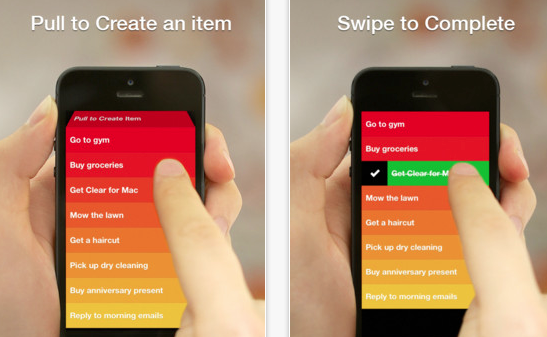
Clear's gesture-based interface makes it fun to check off your chores.

This is hands-down my favorite app purchase of the year,  an app I use nearly every day, and one only made better with the addition of iCloud.

Flickr came out with a major update that puts it back into play after being overshadowed by upstarts such as Instagram.

Sketch Club: This inexpensive, but powerful drawing program has had several important features added this year: improved brush handling, the ability to record your drawing process, and improved sharing features.  Add in the online community with the app, and it’s a great buy at $2.99.

Propellerhead Figure: Sure, it’s just kind of a toy compared to the excellent desktop music package Reason, but man is it fun, and the music engine underneath sounds great.   This has also evolved new features since its launch, like export of sound files.    I’ve spent 99 cents on worse apps, including my own.   I hope that Propellerhead extends their line to make other apps of this type, perhaps something more like a sketchpad for capturing music.

Evernote 5.0: Evernote gave its app quite an overhaul on both desktop and mobile.  While the redesigned desktop client seems to make a bunch of commands much harder to use, the mobile version is much more streamlined and polished.

Hall of Meh:

Google Maps: The UI is not nearly as intuitive as the old Apple-developed Maps app, the typography and layout stick out like a sore thumb, and the app asking for you to sign in with your Google identity doesn’t serve any purpose that helps you.  Lack of address book support is a big step backwards, too. You may find it a must-have app, particularly if Apple Maps isn’t working well for you, but it really seems like a half-hearted effort from Google.

Paper (iPad only): Sure, it’s gorgeous, but its sketchbook UI paradigm gets in the way fast.  The pens are responsive and aesthetically pleasing, but the pricing model of purchasing them individually at $1.99 makes this a very expensive drawing program considering its limitations.  The lack of being able to pinch to zoom on the pages, along with the lack of layer support, make this package pretty much useless for anything but simple doodles.  Also, the reliance on gestures makes it less intuitive than you’d think.

Facebook: While getting rid of their HTML5-based mistake was a good step in the right direction, the new version still lacks the elegance of the original native version, and the addition of advertising that can’t be filtered out only serves Facebook’s bottom line, not the user.

Categories
Blog Mobile News user experience UX

Mobile Links for the end of the year

We’ve all been busy with the last-minute shopping, travel, cooking, and hangover cures, so here’s a rundown with lots of “Best Of” lists, predictions, etc. for the end of the year.

This piece from TechCrunch talks about how the lower advertising return on mobile will affect future sites and products.

UX Magazine talks about the top 5 user experience trends in 2012.

Warren Ellis shares his workflow for writing his new novel GUN MACHINE, using an iPad. Apparently you can write a novel on it after all.

BlueStacks is a desktop virtualization app which enables you to run Android applications on OS X or Windows machines.

The creators of Spun, a new news app for iOS, share their tips for creating a great iOS app.

This is a little bit older, but a great analysis of the inter-company politics behind Apple’s decision to drop Google’s Map API.

Ars Technica presents their in-depth review of the new Google Maps app for iOS.

Mashable ran some great advice for media companies on how to adapt or die.

Bad online search practices taken into real-life situations, courtesy of Google.

Categories
Cool Apps user experience UX

Managing to-do lists with Clear and iCloud

One of the big benefits to upgrading my laptop to OS X Mountain Lion was the ability to finally have all my contacts, calendars, etc. synced on iCloud. This was a big obstacle for me, I had one Mac on iCloud, but most of my email meeting requests and new contacts coming in through my Snow Leopard machine.

The biggest benefit to making the upgrade, however, is the ability to take advantage of apps that fully embrace iCloud.      I’ve been using Realmac’s To-Do List manager Clear for a while on iOS.   It’s a stellar app for the job:  most iOS To Do list managers are overly-complicated, but Clear just lets you make lists, add items, and delete items.  You don’t need to be familiar with GTD (Getting Things Done) or any other methodology.  You don’t need to have read a book describing a system,  you don’t need to register on a web service to sync with your PC.   In fact, up until Version 1.2 of Clear for iOS, there was no desktop syncing, and that was OK, because the app is just so elegant for what it does do.

For those who haven’t used it, Clear is mostly gesture-based — you check off tasks by swiping on the list item, you go up and down the hierarchy of lists and tasks using pinch gestures,  you can add an item either with pull to refresh or with an open pinch.  All of these actions are accompanied by sound queues, and the task lists are sorted by a gradation in background color.  The standard color scheme is a ‘heat-map’ which puts high items in the list in red, and lower items in gradations of orange and yellow.  Completed items turn green before they disappear.   It’s a very satisfying way to interact with a task list, for those who love the process of checking off their tasks.

RealMac introduced a Mac OS X version of the app in early November 2012, and with this version came an update to the iOS version enabling iCloud as well.    The OS X version uses most of the gestures of the iOS version, but adds the ability to look at multiple lists at the same time, and drag tasks from one list to another, and also use keyboard shortcuts for many functions.  It’s not a perfect adaptation, some of the gestures are a little clumsy when you do them on a trackpad, but for those familiar with the iOS version, it’s easy enough to adjust.    On OS X, the Clear interface is simple, takes up very little screen real estate, and is very handy for jotting down quick lists.  On my laptop or desktop, I find myself using it whenever I need to remember a quick list, it’s much more accessible than even Evernote for those ephemeral lists you actually expect to complete.

The big advantage of Clear across the cloud is that iCloud really ties the mobile and desktop versions seamlessly, and in a user-friendly fashion. Whenever you change a list on your handheld or your desktop, you get immediate feedback on that device, but also get audio feedback when the change is propagated through iCloud.  It becomes completely obvious when it is or isn’t working.  You don’t have to think about it.

This is a great example of the power of iCloud, with a sensible implementation that gives the user good information about what is happening while being completely unobtrusive.  I now have these lists synced between my mobile devices and computers at all times, which makes them much more useful.

Clear is currently on sale for Mac OS X for $6.99, which is a great deal over the original price of $14.99.  I think it’s normally $9.99 now. Clear for iOS is currently 99 cents.

Categories
Blog Mobile News user experience UX

Mobile Links for Dec 2-9 2012

This week’s big news on the app side of things was the imminent closure of The Daily, an iPad-only newspaper.  I can’t even type in all the links analyzing why this failed,  just Google ‘The Daily Closes’, and you’ll see.

Craig Mod, one of the developers of Flipboard,  had a very insightful analysis of why News Corp.’s The Daily failed.   It all comes down to something he calls ‘subcompact publishing.’

The term has taken off to describe a very nimble approach to magazine publishing on tablets — content-forward, rather than trying to emulate the paper magazine experience.   This follow-up article from him summarizes some of the discusssion he’s inspired.
My take on things:

  1. Stop trying to squeeze a magazine down into a tablet.  Tablet software needs to be reductive, think of building the least-instrusive means of getting people to the content.
  2. There is a serious gap on the authoring side of things, especially if you want a truly cross-platform experience.  Any workflow starting with Adobe’s professional publishing tools is going to end up with a heavy, slow, hard-to-use mess on mobile.  There is definitely a need for something which makes ‘selling magazines for iPads as easy as blogging.’

I’m not the only one who was a bit put off by Brent Caswell’s  iOS lockscreen redesign proposal, which started with the very arguable thesis that iOS is slow and boring, and therefore needed a whole new layer of UI added before you even unlock the phone.   Jonathan Sutter also addresses the issue, with some intriguing alternatives. He points out that the purpose of the lock screen is not to display random information, but to avoid butt-dialing. Any information on the screen is gravy at best, but adding additional information from background apps would simply require some modification of the current Date/Time layout, not a whole new set of taps and gestures.  Even the current up/down gesture of the camera grabber complicates the screen and undermines the consistency of the UI.

Asymco had a great article about the dangers of outsourcing too much of your manufacturing, with Asus and Dell’s relationship as a cautionary tale.

Apple is assembling some of their new iMacs in the U.S., and Tim Cook hinted that more Macs will be manufactured domestically.   This would especially make sense for a new Mac Pro line, and help explain why a case redesign has taken so long.  Remember long ago when Tim Cook talked about a pleasant surprise in the Mac Pro line in 2013?  The Mac Pro line is the one that relies most on built-to-order manufacturing, so it would be a good fit.

Tim Cook’s interview with Brian Williams this week was very telling about his efforts to run Apple his own way.

T-Mobile, the one US carrier that actually gives you a plan discount for using an unsubsidized phone, is doing away with phone subsidies entirely. Just in time for them to introduce the iPhone on their network.

Square has just announced support for Apple’s Passbook feature, and for gift cards.

Categories
Blog iOS development user experience UX

Thoughts about the iOS lockscreen.

Brent Caswell has an interesting proposal for enhancing iOS’ lock screen making the rounds (via Gruber and Dalrymple) today.

It looks very consistent, but seems a bit fiddly. The minute you have more than one of these lockscreen cards, you have too much swiping and too many decisions to make, and this before you unlock your phone. It’s certainly not the ‘glance and go’ promised by Windows Phone.

It’s going to be hard to change the iOS lockscreen after 5 years, it’s become iconic to the brand, so Apple is going to be very cautious. I could see them doing something like this precisely because it doesn’t change the screen. I feel if you have to do anything more than wake the phone up, you’ve failed.

I can get the time at a glance. Anything more than that, and I’m wrapping my car around a tree. That’s my use case for information on the lockscreen. Windows Phone moves more in the right direction, but their asthetic choice of the Metro look makes it harder to pick out information. It’s like having 5 red and white parking signs on the same pole. Each have similar visual weight, and you end up paying too much attention to the phone. Android Live Wallpapers seem too heavy in both information and processing.

A passively scrolling version of the above proposal might work, as long as bites of information transition quickly enough that you aren’t looking at your phone for a long time and the content requires minimal reading. And you probably shouldn’t have more than 2 of these screens alternating, or you will be looking at the phone for too long. The key is that you are getting the information passively — if you need to interact, you should probably unlock the phone.

It’s all about meeting the ‘don’t die in traffic’ test.

Categories
Comics iPhone Mobile News

New iPad magazine showcases graphic journalism

The comics medium has been used for journalism for a while now. Joe Sacco’s Palestine is a prime example; a personal and immediate first-hand account of life in the occupied territories.

Symbolia Cover ArtSymbolia magazine takes this form of journalism to the iPad as a Newsstand app.

Symbolia is available in the iOS App Store. Download is free, an annual subscription is $11.99 for 6 issues. Single issues will run $2.99. The app comes free with the preview issue, which showcases Susie Cagle’s piece on the Salton Sea.

Newsstand Icons
Newsstand Icons are rendered differently from normal apps, like the Zinio icon at left.
Apple’s Newsstand is a very underrated iOS feature. Newsstand apps are essentially iOS apps with additional privileges that allow pushing of new content to your device so that the latest issue is available to you offline. Apple hasn’t promoted Newsstand much, but there are an impressive number of major titles available, including the New York Times, Sports Illustrated, Esquire, Wired, and others. You can easily differentiate Newsstand apps from others on the app store by their icons; instead of the rounded square icons, Newsstand apps are rendered to look like magazines or newspapers. It’s a good thing, too, as the ‘store’ feature in Newsstand is kind of broken.

Ironically, today News Corp. announced that they are shutting down The Daily, but tablet-based magazines such as Symbolia and Marco Arment’s The Magazine seem to be gaining momentum. The Magazine is already profitable, has hired an editor, and increased its rates for writers. The economics of these magazines are very compelling in comparison to print magazines, and the barriers to entry have never been lower.