I’ve had more time to spend with iTunes 11, and have to say that I’m impressed. The new version dramatically simplifies the clutter iTunes has gathered over the years. Most importantly, the new version introduces a new method of managing song playback that makes iTunes much more usable.
However, this refactoring comes with a learning curve. The reorganization is actually pretty logical, but for a long-time user of iTunes, it’s going to take a little mental recalibration to find things.
Note that I’m looking specifically at the iOS version of iTunes 11. Some UI elements may be different on Windows.
Less Clutter, More Focus
The first thing you’ll notice about the new iTunes is that the sidebars have been eliminated in favor of a segmented control across the top of the window.
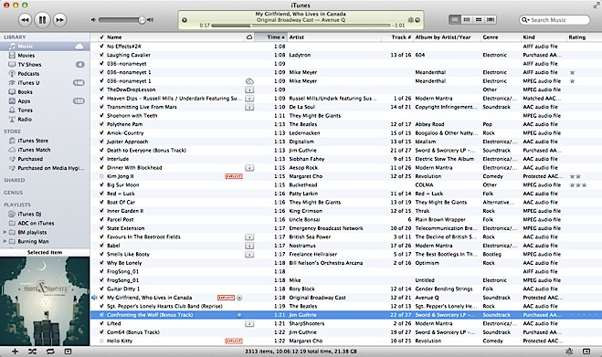
Instead of the old control which let you swap between lists, grids, and cover flow, each of the settings in the segmented control has one view optimized for the type of content being displayed.
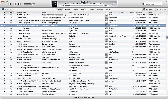
Song view looks relatively unchanged, and the same features for autosizing columns, hiding/showing columns, and dragging and dropping columns into the desired order are still there.
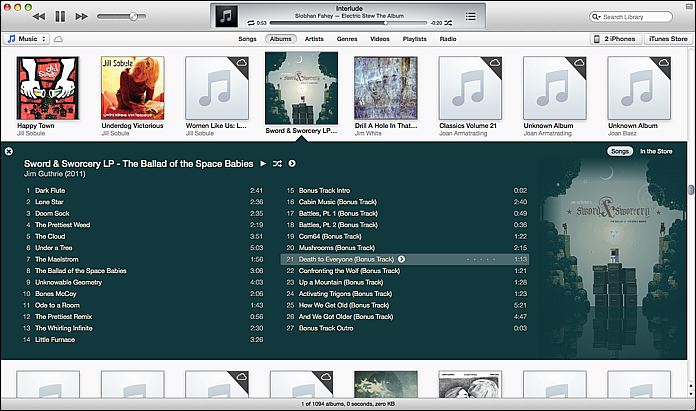
Album view now incorporates album art into the listing, for example. The use of album cover colors to highlight the current album being viewed is both attractive and visually helpful.
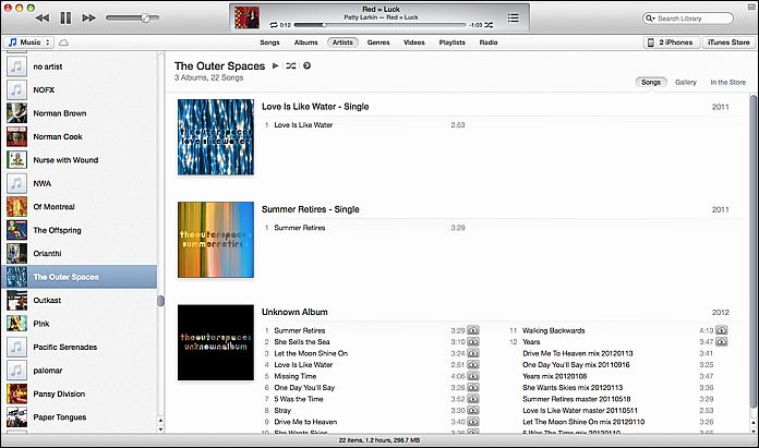
Artist View not only lists content from the artist, but gives you a quick link for finding the artist in the iTunes Store.
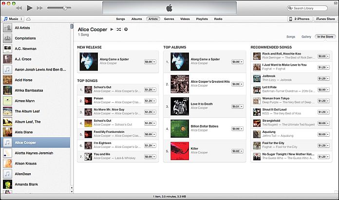
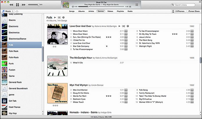
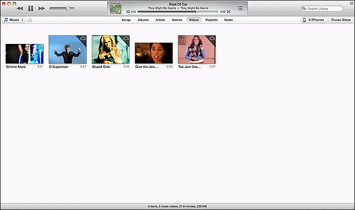
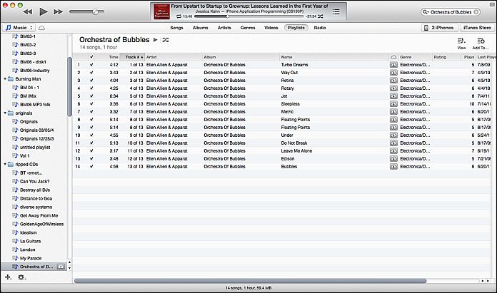
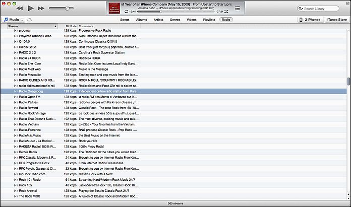
With the exception of the Radio view, most of these views provide both right-click menus and explicit icons for such functions as adding things to play list, toggling shuffle mode, etc.
Playlist Management
With the old sidebar drag and drop no longer available everywhere, playlist management is now a bit harder to find, but logical. Most lists, songs, etc. can be added to an existing playlist via the ‘Add To…’ icon or menu item, which presents a pick list of the playlists.
To start a new playlist from scratch, hit the + icon at the bottom of the sidebar on the playlist view. It’s a little inconsistent to me, but what you use to add songs is the same ‘Add To…’ button.
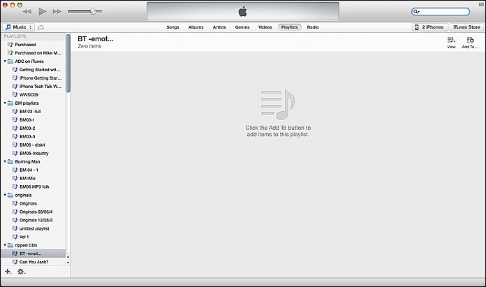
Clicking the Add To button causes the playlist pane to slide to the left and puts you in Song View. Now you can drag and drop songs to your heart’s content. You can drag album covers or song titles from any of the views, you aren’t limited to Song View.
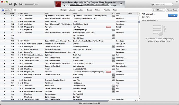
There are alternate ways to get songs onto a playlist as well:
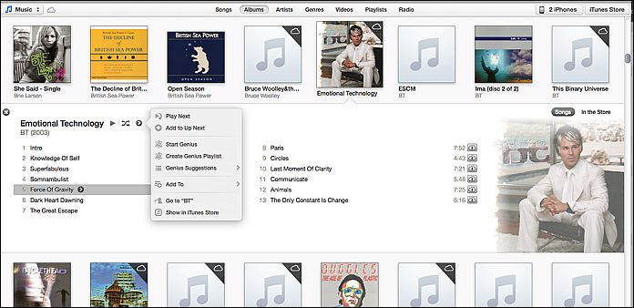
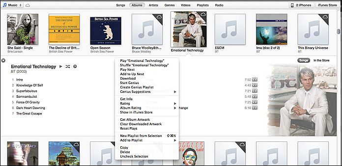
Device Management
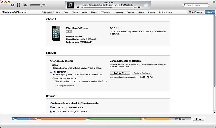
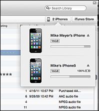
Device management is done in Library mode via a pulldown on the right side of the horizontal navigation bar. This pulldown shows each of the devices connected and charging status for those connected by wire. Clicking on the device gets you the familiar device management page.
“Just make it work the old way.”
If you don’t care for this reorganization, you can make things look mostly like they used to. The traditional iTunes sidebar is still available via the View > Show Sidebar menu item. This disables the modal Show Store/ Show Library button on the horizontal navigation bar and eliminates the device pulldown, but keeps the horizontal segmented control for the different types of content.
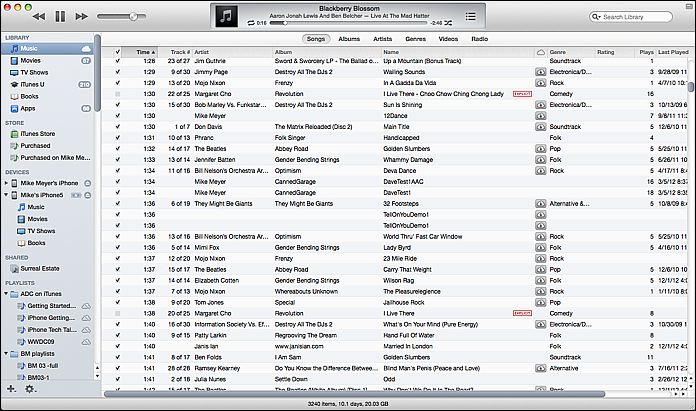
Library Mode and Store Mode

iTunes 11’s new interface has two main modes: library mode, and store mode. They are toggled via a button on the right side of the horizontal nav bar. Store mode and Library Mode have distinctly different visual looks: your library has a light background on the nav bar, the store has a dark background. Note that this distinction is valid even if you are running iTunes 11 in the “Classic” show sidebar view.
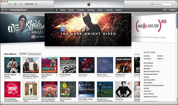
The storefront does add a History pulldown (the button next to the ‘Library’ button) which will show you items that you have browsed recently.
Better control of what you playing
Conceptually, iTunes has always been very playlist-centric, which often would make it hard to know what would be played next when not specifically playing a playlist. This changes somewhat in iTunes 11, though it is easy to overlook at first. Now there is an explicit queue you can use for queueing up your music in advance, called “Up Next.”
Once you know about it, it is a much more intuitive way to schedule playback than the older, more implicit behavior of the playlists. To some extent, this borrows the queue paradigm used by Turntable.fm, but is a much more complete implementation (Turntable lets you add a song to the queue, but always to the topmost next slot).
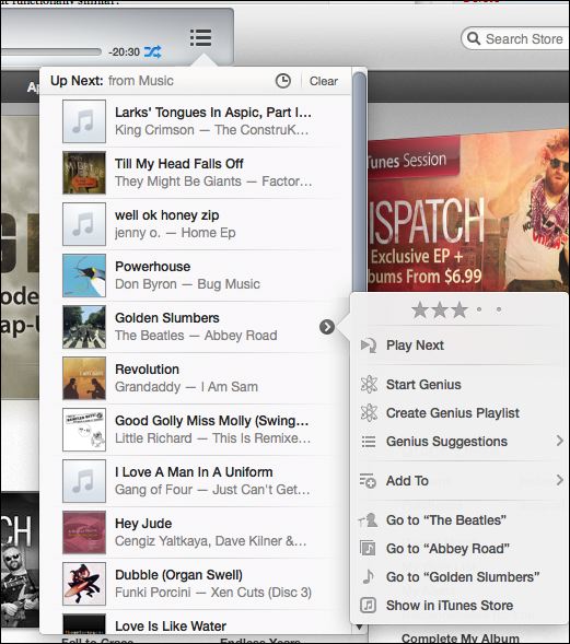
In older versions of iTunes, whatever list of songs was showing in the main window was the queue; the next song to play would depend on where you were browsing at the time and how you had searched or filtered your library. iTunes DJ, formerly ‘Party Shuffle’, was a means of queueing up songs in advance while playing music, but one would have to add the songs they wanted to that playlist, and then arrange them. One needed to be nimble to set up a song as, say, the next one to be played:
- Find song
- Add to iTunes DJ playlist in sidebar
- Go to iTunes DJ playlist
- drag song to next slot in playlist behind currently playing song
“Up Next” changes this paradigm in a subtle but sensible way. You now have a queue of songs that will be played next, and you can simply add a song to the tail of this queue, or add a song to be played next. Right-click and select ‘play next’. The queue can be explicitly viewed on the control area, and can be rearranged via drag and drop. The ‘Play Next’ and ‘Add To Up Next’ functions are available in most menus accessed via the “>” buttons, and via right-click.
Of course, you still have the ability to immediately play a song, and if you haven’t explicitly added anything to the queue, iTunes will play songs much as before, basically using the list you have displayed. You will, however, be able to view this in the Up Next window. Should you be browsing music and decide to immediately play a song while you are playing an Up Next queue, iTunes will warn you and give you the option of clearing the queue or just playing the song and continuing with the queue afterwards. You can add entire albums and playlists to the queue as well.
Improved iCloud support
Whereas the old iTunes made a big deal about iCloud, iTunes Match is no longer spelled out as a separate playlist item. Songs that are on iTunes Match are clearly marked, can be played via streaming, or downloaded to the local machine using the download icon. Device management pages are clear about whether devices are backed up to iCloud.
The MiniPlayer is more powerful
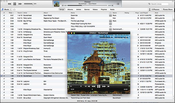
The iTunes mini-player has always been a good way to get iTunes out of the way while working. iTunes 11 takes the mini-player beyond mere deck control (play, pause, skip) and adds Airplay support, search, and the Up Next interface.


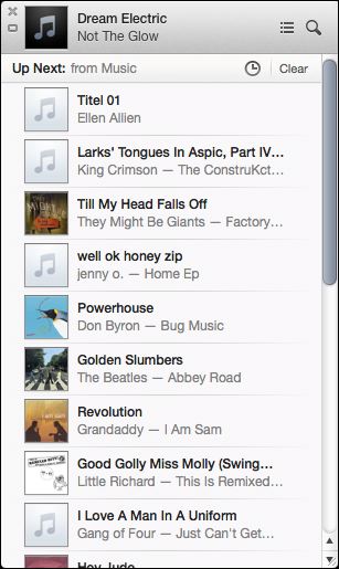
The Up Next icon expands the MiniPlayer into a list view you can edit on-the-fly, bumping songs to the top, searching for new songs or albums to add, and basically the full functionality of the Up Next feature.
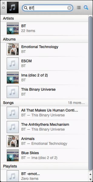
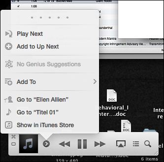
Clicking the Search icon gets you a very smart search which will let you add songs, albums, or playlists to the Up Next. Songs can be prioritized to play next as well.
This version of the mini-player actually takes up less screen space than its predecessor. One way it does this is through the elimination of the visual indicator of playback progress and the volume control. It’s a trade-off I think I can live with — while you can’t see time remaining or control your volume, you can find new songs, set them to play next or arrange them in the queue without leaving the mini-player.
Another difference of note is that the mini-player is no longer accessed via the standard maximize window control, there is a separate icon on the upper right corner of the iTunes interface that does this. Now the standard maximize button toggles full screen mode, bringing iTunes back into compliance with OS X Human Interface Guidelines. The user can now have both the full-sized player and mini-player visible at the same time as well. Option-Command M toggles between the two views.
Quibbles
Such a huge change is not without its quirks and omissions. Apple is apparently working to restore the old ‘Find duplicates’ feature already. Cover Flow is gone and probably not coming back, though even that is not necessarily permanent based on the outcry.
Playlists can’t be opened in separate windows for comparison.
Up Next has a little clock icon which toggles you between playback history and Up Next mode. This is kind of cryptic, though there is a tool tip on the icon. I liked the older iTunes DJ format of being able to scroll back in time before the current song.
Cover Flow, once a much-ballyhooed feature of iTunes, is no longer used. You may or may not miss it; I rarely used it, and in some contexts, like looking at app icons, it was downright silly.
There are sure a lot of ways to add things to playlists now, but starting a playlist is kind of a ride. It’s easy to get confused about what you can do in each context, and you never had to think about this nearly so much in the old sidebar-only, playlist-centric days.
Have Fun
To summarize, iTunes 11 is definitely different, anyone used to the old interface will scratch their head at times. However, the ability to really DJ live with the player is greatly enhanced by the Up Next feature. Up Next is a big improvement, and the new mini-player puts a remarkable amount of power at your fingertips.
