Categories
iOS development iPhone Web Design Web development

WPtouch is an awesome way to get your blog on the iPhone

Since I’ve been studying how to optimize web pages for the iPhone, I decided to quit procrastinating and finally install WPTouch, a WordPress plug-in that generates a very iPhone-friendly version of your WordPress Site.IMG_0108

WPTouch provides some very elegant UI attributes, including a search panel that slides in, Google Adwords for Mobile support, and the whole presentation is very configurable. Also, you have a switch that will let you go to and from the standard browser layout, so you aren’t stuck with the theme. WP Touch is considered a theme, but is installed as a WordPress plug-in, since it has to inject some code into your pages in order to do the theme-swapping.

Mike-icon-snapshot
Obey the foot. See how happy it will make him?

So, you may be asking, “how do you get one of those neat-o icons that you can put on your iPhone home screen to jump directly to the web site?”
This blog post has a great tutorial of how to set up your icon app if you are using the plug-in. Normally in a static web site, you just create a 57×57 pixel PNG file and name it icon.png, and link to it in your HTML header:


Oddly enough, the apple-touch-icon link is not part of standard wordpress themes in general. I guess that’s not so weird considering the themes are designed for desktop rather than mobile, but it is annoying that the iPhone plug-in can do this but the standard view of the site can’t be saved with your custom icon to the iPhone home page.

I’m looking forward to seeing how this mobile page looks on other devices, apparently the user agent sniffing done by the plug-in can also supply the page for Blackberry, Android, and others.
Categories
Web Design Web development

Theming WordPress plug-in content

I have to say that I really like the delicious plugin (del.icio.us for WordPress, by Ricardo Gonzalez), but it didn’t quite look right in the Constructor theme that I am using. The heading didn’t match the rest of the theme headings, and there was text following the link names specifying when the link was posted, but it was indistinguishable, i.e. same style.

(Delicious.com, or del.icio.us,  is a social bookmark site, you can save bookmarks to the cloud and share them with your friends.  You tag the links, they’re searchable, your list of links is browsable, and the ability to access that cloud on your blog is a great little feature.)

Turns out when you look at the source code generated by the widget, it does have custom classes for these elements:

Delicious_title_link   -- the actual title used in the sidebar
Delicious-item    	--  the specific link list item
Delicious-link     -- the link itself
Delicious-timestamp  -- the time for the item (e.g. “36 mins ago”)

Fortunately, Constructor lets you add your own CSS rules to the theme in a separate CSS file that won’t be overwritten when you update the theme files. This is a great place for adding the rules you need.

So, I added the following to the css file, just to differentiate that time stamp with smaller italic text in a contrasting color, and to make the title link look like the other sidebar headings:

.delicious-timestamp {
font-size: smaller;
font-style: italic;
color: #2F608A
}

.delicious_title_link {
color: #2F608A;
}

Voila, now things match, and if I should build my own custom theme from scratch later, I can just lift these rules to accommodate that widget, or any other widgets with their own CSS classes.

Categories
Blog Web Design Web development

Theming WordPress – work in progress

Still working on theming the site and installing the plug-ins I want.

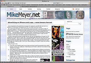
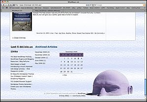
I ended up selecting the theme Constructor for now, which looks relatively nice out of the box.  The theme supports several different layouts, and lets you customize a lot of things.

StockConstructorSkin StockConstructorSkin2

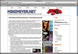
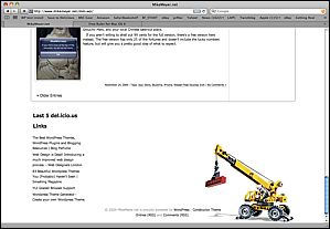
Here’s the same theme with a few minor adjustments, mostly different background images and font tweaks:

MyConstructorSkin1 MyConstructorSkin2

I’d spent a bunch of time scratching my head over how I might do something similar to the legos/crane motif. Finally, I found something I could isolate and put into the theme, and just went with a simple photocollage for the header file. I played with a few backgrounds, and decided to go with a bright, fairly neutral glass texture. With a couple hours of Photoshop, now the page looks more like my old one.

And, just for giggles, here’s what my test version of the site looks like with the default WordPress theme.  It’s quite boring, and requires you to shove everything off to the left side.

Boring. The only thing you can change visually is the color of that blue bar at top, you can't even just drop in your own header graphic.

I will say that I am struggling a bit with the flow of the content inside these posts, things really fall apart if you have more than one small graphic, it seems. Perhaps I’m not doing this the easy way, I did see that wordpress has a built-in gallery function for putting a bunch of graphics in a post, but they didn’t look so good to me. Suppose my next step is to RTFM before I blame the theme or WordPress. I also think that my articles are already proving to be too long for the front page, I should use excerpts, but not sure if the theme supports that. At the very least, I may need to override some more things in the style sheet.